“UX Design is picking colors and making it look pretty, right?” Not entirely.
As we previously discussed in the last UX post, design phase solutions are based on research findings from the insight phase, and is where all the fun begins.
This is part two of a three-part blog series diving deeper into the phases of the UX process, and how that process helps bring better solutions to more users faster. You’ll also learn details about how solutions are designed, and what involved in that process.
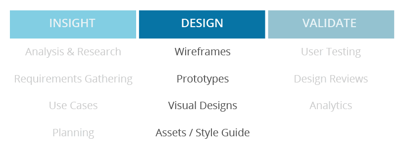
In this phase, UX designers take all findings from the insight phase, apply it to the requested work (ex: new feature, enhancement, etc), ensure that industry standards (ex: for security, web technology, usability, accessibility, etc) are being adhered to, and that the process workflow makes sense when coming up with a design solution. These steps require each designer to be a subject matter expert in whatever area is being worked on, know enough about the users it affects, as well as what technical limitations and requirements need to be taken into account. That’s a lot of information to organize.
Designers typically start by sketching out ideas on paper or digitally to get a high-level grasp of the bigger concepts, and map out potential workflows. They frequently include other stakeholders like product managers, developers, support, and trainers for input on scenarios from the user’s perspective. Including others within the design process ensures a few key things:
- Solutions are not being designed in a vacuum
- Including others who have a more in-depth understanding of the specific user personas that relate to the project, ensures that the quality of information isn’t lost
- There’s transparency about what needs are being communicated, and what suggestions are being planned to address them
UX Visual Designs
Once a solid workflow and understanding of the needs are agreed on, designers then dig in to create visuals to illustrate the detailed process.
Wireframes are used when the focus should be kept on functionality and not aesthetics. They typically are black and white, don’t include any visual styling aside from design elements that would help distinguish components, and include brightly colored notations calling out specific items or functionality that should be noted or needs more context.
They typically contain fake information to get a general sense of content and context, as well as segments that may be broken out for a staged release towards full functionality.
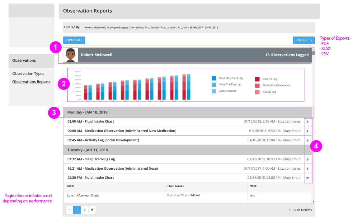
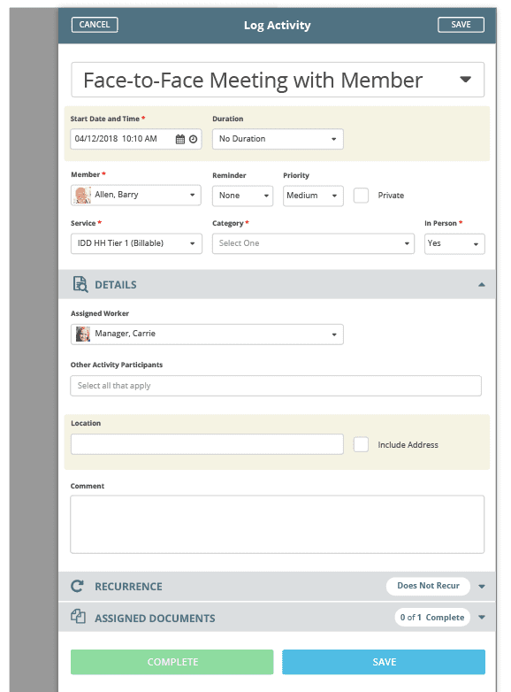
High-fidelity mockups are created to help present the solution with an almost 100% accuracy of what the user would see when interacting with the feature. These are typically used for presentations on upcoming features, creating working prototypes for user testing, and communicating any new/existing visual styles.
During design, visual or usability standards are referenced and updated if needed. The design team typically has their own resources for standardized and styled components in which to build out wireframes and mockups. Design tools such as Adobe Illustrator, Photoshop, After Effects, Balsamic, InVision, and more are powerful ways to keep visuals organized and create source files for ongoing projects.
Once designs are finished, they’re presented and reviewed by stakeholders related to the project. At this point, the ideas and designs can be moved to the next phase in which the solution can be validated through testing. Depending on the findings, it may go back into design or it may proceed to be fully documented in order to hand of to the engineering team to create it. Even through development, it’s periodically being tested internally and externally to ensure that no other changes are needed.


